10 CTA optimization tips for higher eCommerce sales
Sep 7, 2024 16 min read

The “call to action” (CTA) plays a key role in eCommerce sales and conversions, as it enables users to move forward in the customer journey.
The “call to action” (CTA) plays a key role in eCommerce sales and conversions, as it enables users to move forward in the customer journey. Whether you’re encouraging customers to add an item to their shopping cart, make a purchase, share that purchase on social media, or subscribe to your brand’s email newsletter, your online storefront should display clear, persuasive CTAs—supported by intelligent, data-driven design.
The average conversion rate is currently around 3%, which means that 96 out of 100 users don’t engage with or respond to a website’s CTAs. While there are a wide range of steps that can be taken to improve customer engagement, many businesses fail to include effective CTA optimization in their sales and marketing strategies, resulting in missed opportunities to increase revenue and better understand their customers.
So how do brands successfully design, implement, test, analyze, and refine website CTAs? Let’s take a look at the 10 most important CTA optimization techniques for maximizing eCommerce sales and conversions.
Research shows that online shoppers are more likely to view and purchase products that are in limited supply. This is known as the scarcity principle, and it’s leveraged by today’s most successful online retailers, such as Walmart, Disney, and Forever21. When designing CTAs, there are many ways to create urgency in the mind of the consumer. Here are a few common examples:
It’s important to be as clear as possible with CTAs, and avoid vague labels like “Continue” or “Cancel.” This kind of text confuses customers and increases the likelihood of them abandoning their cart. The CTA should effectively tell customers what the next step in the process is, whether that’s making a payment, providing shipping information, reviewing order details, or signing a terms of service agreement.
For example, rather than saying “Continue” at the bottom of a checkout page, your CTA should say something like “Continue to Payment.” The trick here is to provide specific messaging for the user, without making the CTA too wordy.
Outdated eCommerce sites often use hyperlinked text—like the kind you’ve seen in this article—as their main form of CTAs. This lazy design approach not only makes brands look unprofessional, but it also discourages users from clicking through to the next page.
By simply making your CTA buttons actually look like buttons, you will increase engagement from site visitors. Since this does a better job of catching users’ eyes, displaying buttons—as opposed to regular text—can lead to a 45% boost in clicks.
There are a few key pieces of information that most customers need in order to curb buyer anxiety and feel confident about their purchase, especially in an eCommerce environment where they can’t actually see or touch the product.
First, customers want to know that other people have bought the item and are satisfied with it. You can showcase this by displaying customer ratings and reviews in close proximity to the product page’s CTA button. You should also use badges and icons to highlight top selling products.
Second, aside from basic product details, customers want to see unique selling points. What makes your product different from other ones like it on the market? Does it come with any particular certifications or guarantees? All product differentiators should be communicated clearly and within the same space as the CTA button.
Finally, customers prefer transactional assurances to alleviate point-of-action stress. Depending on your business’ policies, checkout CTAs should be accompanied by a checklist of assurances, such as free shipping, free returns, the ability to cancel orders within 24 hours, the option to buy online and pick up in store, and so on.
According to a recent study by HubSpot, personalized CTAs are 202% more effective than basic CTAs. But what exactly is the difference between the two?
A personalized CTA changes based on the user viewing it, while a basic CTA always remains the same. Now, in certain scenarios, there’s not much room for CTA personalization—but when applicable, they can make a huge difference in the customer journey.
For example, when a user visits your site for the first time, they can be prompted on the homepage to take a product finder quiz, browse products, or learn more about your brand’s mission. When a recurring customer visits your site, they can be presented with a message like “Welcome back, [customer’s name],” then prompted to return to previously-viewed product pages or other content. In the former scenario, the personalized CTA is introducing new customers to your brand and its products, while in the latter, it’s helping existing customers pick up where they left off.
By integrating advanced tools for collecting, analyzing, and acting on valuable user data from your eCommerce site, your sales and marketing team will be able to leverage dynamic, personalized CTAs that drive higher sales and conversions.
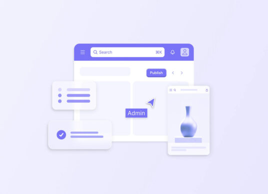
To get the most clicks possible, your site’s CTAs must adhere to certain design conventions, based on natural customer expectations and preferences. This means placing and sizing different page elements—including the CTA button—in a predictable fashion.
With product details pages (PDPs), for example, users expect to see product images on the left, and the description and CTA on the right.
Here are some other design principles to keep in mind:
For pages with multiple CTAs, you’ll need a visual hierarchy to express which ones are most important. This will help keep more customers on the path toward making a purchase, signing up for a subscription, connecting with a sales representative, or whatever it is the page is trying to accomplish.
To use PDPs as an example again, the “Add to Cart” button will certainly rank higher on the visual hierarchy than the “Add to Wishlist” or “FAQ” button—since the page’s primary goal is to sell that product. Therefore, the “Add to Cart” button should be more brightly colored and located higher up on the page than those other two buttons.
Human nature shows us that people will largely evaluate things based on previous beliefs or pieces of information they’ve been presented with. Sales and marketing teams apply this to pricing strategies, displaying a product’s original price and its discounted price right next to each other.
For instance, if a customer sees that the item’s original price was $500, but now it’s available for $300, they’re more likely to make the deal. This is called price anchoring, and it’s often used to make CTAs more appealing on eCommerce sites.
Not all popups are created equal. Some are just plain irritating, while others can be helpful and meaningful for the user. Behavior-triggered popups, in particular, act as personalized CTAs that promote greater customer engagement.
When a user stalls out while viewing a PDP, a message can automatically pop up, prompting them to add the item to their cart, checkout, or save the item for later. If the user brings their cursor toward the right hand corner of their screen, that can trigger an exit-intent popup, which offers them a coupon or discount. There’s also an opportunity for a scarcity play here, as the popup can show how many people are viewing the item in that moment, or how many units are left in stock.
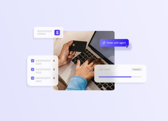
There’s no one-size-fits-all solution for CTA optimization, as every brand has its own unique requirements and customer expectations. To figure out which CTAs work best for your site, you’ll want to perform a series of A/B tests.
This involves experimenting with two different versions of the same CTA, then analyzing user data so see which one performs better. Throughout this process, you may try out different layouts, colors, sizings, locations, and so on.
By including effective CTA optimization in your business’ sales and marketing strategy, you will improve customer engagement and gain more revenue from your online store. But it’s not enough to simply follow the guidelines discussed above. The process of collecting and analyzing user data, testing out different CTA designs, and continuously refining the customer experience requires significant time, effort, and expertise. And that’s where Codal comes in.
Codal is an award-winning UX design and development agency that specializes in eCommerce solutions. We’ve built D2C storefronts, B2B sales portals, mobile apps, internal data analytics systems, and other digital products that help our clients maximize customer engagement, sales, and conversions.
For example, we recently built a cutting-edge eCommerce experience for a historic specialty food retailer—one that facilitates a smooth, fun, and unique buyer journey. This required a top-to-bottom transformation of the brand’s online storefront, which included designing, testing, and tracking the performance of various CTAs. You can learn more about that project here.

Explore our latest expertise on innovation, design, and technology, or connect with us directly to see how we can help accelerate your digital transformation.